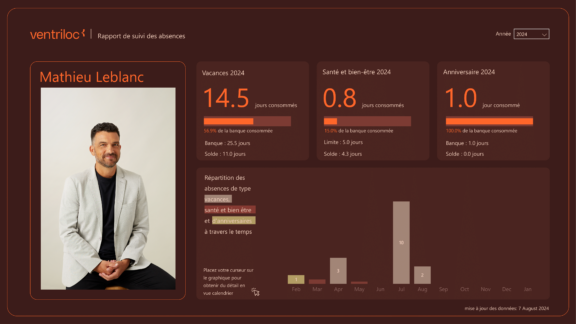
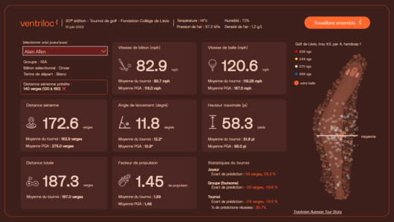
At Ventriloc, we believe an effective dashboard should be more than a collection of charts. It should allow decision-makers to answer their most critical business questions at a glance. When a technical challenge arises, we see it not as a limitation, but as an opportunity to innovate.
This case study highlights how we pushed beyond the boundaries of native Power BI visuals to deliver a solution that is elegant, maintainable, and highly functional.
The objective was to design a visual that does not exist out of the box in Power BI: a single chart combining sales, cost of sales (with the ability to toggle it on or off), and a comparison against the previous period. To achieve this, we combined the flexibility of the Deneb custom visual (Vega-Lite) with SVG and HTML techniques, significantly enhancing both functionality and user experience.
The Client Challenge
The client needed to display four key KPIs on a single page. The most complex of these was Sales, which we will focus on for simplicity.
For this KPI, the requirements were clear but demanding:
- Display both current sales and cost of sales in the same visual
- Allow users to show or hide cost of sales via a toggle
- Apply conditional formatting only to the sales bar for the most recent period
In other words, the visual had to support highly targeted conditional formatting within a multi-series chart—something that simply cannot be achieved with standard Power BI visuals.
Why Native Power BI Visuals Fell Short
Power BI’s native visuals cover the vast majority of analytical use cases and already offer conditional formatting in tables, matrices, and basic charts. However, as outlined in Microsoft’s official documentation, conditional color rules in bar and column charts are applied at the series level, not at an individual data point level within a multi-measure visual.
In practical terms, this means that when multiple measures are present in a chart, you cannot apply conditional logic to only one of them.
Rather than viewing this as a flaw, we see it as a deliberate design choice focused on simplicity and usability. For more advanced scenarios, Microsoft provides certified custom visuals through AppSource, such as Deneb, that unlock a much higher level of control. This approach allows organizations to combine the stability of native visuals with the creative freedom of advanced customization when needed.
Deneb as the Core of the Solution
The foundation of the solution was a Deneb visual, built using Vega-Lite JSON, featuring:
- Two bars: one for sales and one for cost of sales (controlled by a toggle)
- A line with a point representing the previous period
- Conditional logic driven by a Field Parameter, allowing users to switch between monthly, quarterly, and yearly views
The key innovation was the conditional formatting logic. The JSON specification identified the latest available period and applied:
- Green when sales exceeded the previous period
- Red when sales underperformed
All other bars remained a neutral grey, ensuring the user’s attention was immediately drawn to the most relevant data point.
JSON – DENEB – 2 bars, 1 conditonal formatting, 1 line
{
  "$schema": "https://vega.github.io/schema/vega-lite/v5.json",
  "usermeta": {
    "information": {
      "uuid": "800a282f-248f-4452-a16a-4b0512f25b72",
      "generated": "2026-01-13T19:45:34.507Z",
      "previewImageBase64PNG": "data:image/png;base64,iVBORw0KGgoAAAANSUhEUgAAAAEAAAABCAQAAAC1HAwCAAAAC0lEQVR42mNkYAAAAAYAAjCB0C8AAAAASUVORK5CYII=",
      "name": "trend_barchart_two_bars_one_conditional_format_plus_line",
      "description": "Monthly trend chart with clustered bars for current Sales and Cost, plus a prior-period Sales line. The latest Sales bar is conditionally colored based on performance vs the prior period.",
      "author": "Catalina Moreno"
    },
    "deneb": {
      "build": "1.8.2.0",
      "metaVersion": 1,
      "provider": "vegaLite",
      "providerVersion": "6.4.1"
    },
    "interactivity": {
      "tooltip": true,
      "contextMenu": true,
      "selection": true,
      "selectionMode": "simple",
      "highlight": false,
      "dataPointLimit": 50
    },
    "config": "{}",
    "dataset": [
      {
        "key": "__0__",
        "name": "Month",
        "description": "",
        "kind": "column",
        "type": "dateTime"
      },
      {
        "key": "__1__",
        "name": "Sales",
        "description": "",
        "kind": "measure",
        "type": "numeric"
      },
      {
        "key": "__2__",
        "name": "Cost",
        "description": "",
        "kind": "measure",
        "type": "numeric"
      },
      {
        "key": "__3__",
        "name": "Sales (Previous Period)",
        "description": "",
        "kind": "measure",
        "type": "numeric"
      }
    ]
  },
  "data": {
    "name": "dataset"
  },
  "transform": [
    {
      "calculate": "if (isDefined(datum['__0__']), timeFormat(datum['__0__'], '%b %Y'), if (isDefined(datum['Quarter']), timeFormat(datum['Quarter'], '%b %Y'), toString(datum['Year'])))",
      "as": "FP"
    },
    {
      "calculate": "if (isDefined(datum['__0__']), datum['__0__'], if (isDefined(datum['Quarter']), datum['Quarter'], datetime(datum['Year'], 0, 1)))",
      "as": "FP_sort"
    },
    {
      "window": [
        {
          "op": "row_number",
          "as": "FP_index"
        }
      ],
      "sort": [
        {
          "field": "FP_index",
          "order": "ascending"
        }
      ]
    }
  ],
  "layer": [
    {
      "transform": [
        {
          "aggregate": [
            {
              "op": "sum",
              "field": "__1__",
              "as": "sum_Sales"
            },
            {
              "op": "sum",
              "field": "__3__",
              "as": "sum_Prev_Sales"
            }
          ],
          "groupby": [
            "FP",
            "FP_sort",
            "FP_index",
            "__identity__",
            "__selected__"
          ]
        },
        {
          "window": [
            {
              "op": "row_number",
              "as": "row_num_desc"
            }
          ],
          "sort": [
            {
              "field": "FP_sort",
              "order": "descending"
            }
          ]
        },
        {
          "calculate": "datum.row_num_desc === 1 ? true : false",
          "as": "is_latest"
        },
        {
          "filter": "datum['sum_Sales'] != null"
        }
      ],
      "mark": {
        "type": "bar",
        "size": 8
      },
      "encoding": {
        "x": {
          "field": "FP",
          "type": "ordinal",
          "sort": {
            "op": "min",
            "field": "FP_index",
            "order": "ascending"
          },
          "axis": {
            "title": null,
            "domain": true,
            "domainColor": "#e6e6e6",
            "domainWidth": 1,
            "ticks": false,
            "labelFont": "Segoe UI",
            "labelFontSize": 11,
            "labelPadding": 8,
            "labelAngle": 0,
            "labelOverlap": "greedy",
            "labelSeparation": 5,
            "labelBound": true
          },
          "scale": {
            "paddingInner": 1
          }
        },
        "y": {
          "field": "sum_Sales",
          "type": "quantitative",
          "axis": {
            "title": null,
            "domain": false,
            "ticks": false,
            "grid": true,
            "gridColor": "#e6e6e6",
            "gridWidth": 1,
            "labelFont": "Segoe UI",
            "labelFontSize": 11,
            "labelPadding": 8,
            "labelExpr": "datum.value >= 1000000 ? format(datum.value/1000000, '$,.1f') + 'M' : datum.value >= 1000 ? format(datum.value/1000, '$,.0f') + 'k' : format(datum.value, '$,.0f')"
          }
        },
        "color": {
          "condition": [
            {
              "test": "datum.is_latest && datum['sum_Sales'] > datum['sum_Prev_Sales']",
              "value": "#59B973"
            },
            {
              "test": "datum.is_latest && datum['sum_Sales'] <= datum['sum_Prev_Sales']",
              "value": "#CF202E"
            }
          ],
          "value": "#D9D9D9"
        },
        "xOffset": {
          "value": -3
        },
        "tooltip": [
          {
            "field": "FP",
            "title": "Period:"
          },
          {
            "field": "sum_Sales",
            "title": "Sales Current:",
            "format": "$,.0f"
          },
          {
            "field": "sum_Prev_Sales",
            "title": "Sales Prior period:",
            "format": "$,.0f"
          }
        ],
        "opacity": {
          "condition": {
            "test": {
              "field": "__selected__",
              "equal": "off"
            },
            "value": 0.3
          },
          "value": 1
        }
      }
    },
    {
      "transform": [
        {
          "aggregate": [
            {
              "op": "sum",
              "field": "__2__",
              "as": "sum_Cost"
            }
          ],
          "groupby": [
            "FP",
            "FP_sort",
            "FP_index",
            "__identity__",
            "__selected__"
          ]
        },
        {
          "filter": "datum['sum_Cost'] != null"
        }
      ],
      "mark": {
        "type": "bar",
        "size": 8
      },
      "encoding": {
        "x": {
          "field": "FP",
          "type": "ordinal",
          "sort": {
            "op": "min",
            "field": "FP_index",
            "order": "ascending"
          },
          "scale": {
            "paddingInner": 0.4
          }
        },
        "y": {
          "field": "sum_Cost",
          "type": "quantitative"
        },
        "color": {
          "value": "#989898"
        },
        "xOffset": {
          "value": 6
        },
        "tooltip": [
          {
            "field": "FP",
            "title": "Period:"
          },
          {
            "field": "sum_Cost",
            "title": "Cost Current:",
            "format": "$,.0f"
          }
        ],
        "opacity": {
          "condition": {
            "test": {
              "field": "__selected__",
              "equal": "off"
            },
            "value": 0.3
          },
          "value": 1
        }
      }
    },
    {
      "transform": [
        {
          "aggregate": [
            {
              "op": "sum",
              "field": "__3__",
              "as": "sum_Prev_Sales"
            }
          ],
          "groupby": [
            "FP",
            "FP_sort",
            "FP_index",
            "__identity__",
            "__selected__"
          ]
        },
        {
          "filter": "datum['sum_Prev_Sales'] != null"
        }
      ],
      "mark": {
        "type": "line",
        "interpolate": "natural",
        "point": {
          "size": 20,
          "filled": true,
          "color": "#605E5C"
        },
        "strokeWidth": 1,
        "color": "#605E5C"
      },
      "encoding": {
        "x": {
          "field": "FP",
          "type": "ordinal",
          "sort": {
            "op": "min",
            "field": "FP_index",
            "order": "ascending"
          },
          "scale": {
            "paddingInner": 0.6
          },
          "axis": {
            "title": null,
            "domain": true,
            "domainColor": "#e6e6e6",
            "domainWidth": 1,
            "ticks": false,
            "labelFont": "Segoe UI",
            "labelFontSize": 11,
            "labelPadding": 8,
            "labelAngle": 0,
            "labelOverlap": "greedy",
            "labelSeparation": 5,
            "labelBound": true
          }
        },
        "y": {
          "field": "sum_Prev_Sales",
          "type": "quantitative"
        },
        "opacity": {
          "condition": {
            "test": {
              "field": "__selected__",
              "equal": "off"
            },
            "value": 0.3
          },
          "value": 1
        }
      }
    }
  ],
  "config": {
    "mark": {
      "invalid": null
    },
    "view": {
      "stroke": null
    },
    "axis": {
      "domainColor": "#666666",
      "tickColor": "#666666",
      "labelColor": "#666666",
      "grid": false
    }
  }
}
Enhancing the Experience with SVG and HTML
While Deneb handled the core visualization, two additional elements significantly elevated the user experience.
Dynamic SVG Legend
The legend was generated dynamically using a DAX measure that outputs SVG. It automatically adjusted based on the cost toggle, ensuring perfect alignment between the legend and the visual at all times.
💡 Pro tip
If you want to speed things up, you can use the Export SVG to Power BI plugin for Figma designed by Ventriloc. It allows you to quickly convert SVG assets into Power BI–ready visuals, significantly reducing manual adjustments and ensuring design consistency between Figma and Power BI.
Here’s the link : Convert SVG to Power BI
Legend – SVG Visual – One Pager
SVG Sales Legend onepager =
VAR _selection = LOWER(SELECTEDVALUE(others_selector_time_period[value]))
/*"data:image/svg+xml;utf8,"*/
var _with_cos =
"SalesCost of SalesAbove prior "&_selection&"Below prior "&_selection&"Prior "&_selection&""
VAR _without_cos =
"SalesAbove prior "&_selection&"Below prior "&_selection&"Prior "&_selection&""
RETURN
SWITCH(
    SELECTEDVALUE(others_selector_cost_visible_onepager[is_cost_visible]),
    "Yes",_with_cos,
    "No",_without_cos,
    _with_cos
)
HTML Variance Indicator
We also built a variance indicator using HTML, displaying the difference between current sales and the previous period using arrows, colours, and percentages. HTML allowed for precise visual alignment and consistency, even as text lengths changed.
HTML – DAX – One Pager
HTML - Sales var vs previous period onepager =
-- Get the selected time period from the slicer (e.g., "Week", "Month", etc.)
VAR _period = SELECTEDVALUE(others_selector_time_period[value])
var _previous_period =
SWITCH(
SELECTEDVALUE(others_selector_time_period[value]),
"Week", MAX ( dim_date[start_of_week] ),
"Month", MAX(dim_date[start_of_month]), // Latest month in context
"Quarter", MAX(dim_date[start_of_quarter]),
"Year", MAX(dim_date[year])
)
-- Get the corresponding CURRENT value based on the selected period
VAR _current = [Switch Total Sales (current time period)]
-- Get the corresponding PREVIOUS value based on the selected period
VAR _previous = [Switch Total Sales (previous time period)]
-- Calculate the absolute difference
VAR _diff = _current - _previous
-- Calculate the relative % difference (safe division)
VAR _diff_pct = DIVIDE(_diff, _previous, BLANK())
-- Format both values for display
VAR _diff_formatted = FORMAT(_diff, "$#,0")
VAR _diff_pct_formatted = FORMAT(_diff_pct, "0.0%")
var _color = IF(_diff>0,"#59B973",IF(_diff0,"↑ ",IF(_diff0,"above ",IF(_diff<0,"below ","vs "))
RETURN
"<span style='";font-size:12px;font-family:Segoe UI;font-weight:600'>"&_arrow&""&_diff_formatted&" ("&_diff_pct_formatted&")</span> " &
"<span style='color:#666666;font-size:12px;font-family:Segoe UI;font-weight:600'>"&_word&""&[Note previous time period onepager]&"</span>"
Final Outcome
The final visual proves to be both powerful and intuitive.
When Show Cost of Sales is turned off, users see a clean sales-only view with a simplified legend. When enabled, the cost bar and full legend appear seamlessly. In all cases, conditional formatting highlights only the most recent sales period.
This single visual allows the client to answer their key business questions without cluttering the dashboard, while still surfacing critical insights. An Access more details button provides a clear path to secondary reports for deeper analysis.
Conclusion
This project clearly demonstrates the value of custom visuals when standard tools reach their limits. At Ventriloc, we don’t stop at native Power BI capabilities—we leverage advanced techniques to unlock the full potential of the platform.
By combining Deneb, SVG, and HTML, we turned a perceived limitation into an opportunity for innovation, delivering a truly unique Power BI visual that continues to help our client make faster, more confident decisions.
Fore more information about the author : Catalina Moreno | Team | ventriloc


